How better data changed the public's mind about crime
For the first time in decades, a crime decline is matched in public opinion data
Crime is down, violence is down, and the public seems to be catching on. It’s quite an interesting moment. I wrote a couple of weeks ago that ‘crime’ is not one thing, and thinking about it that way is generally unhelpful. But let’s set that aside for just a moment because it might be helpful in the present circumstance, and ask, “Why are public perceptions of crime and safety converging with national crime statistics for the first time in a generation?”
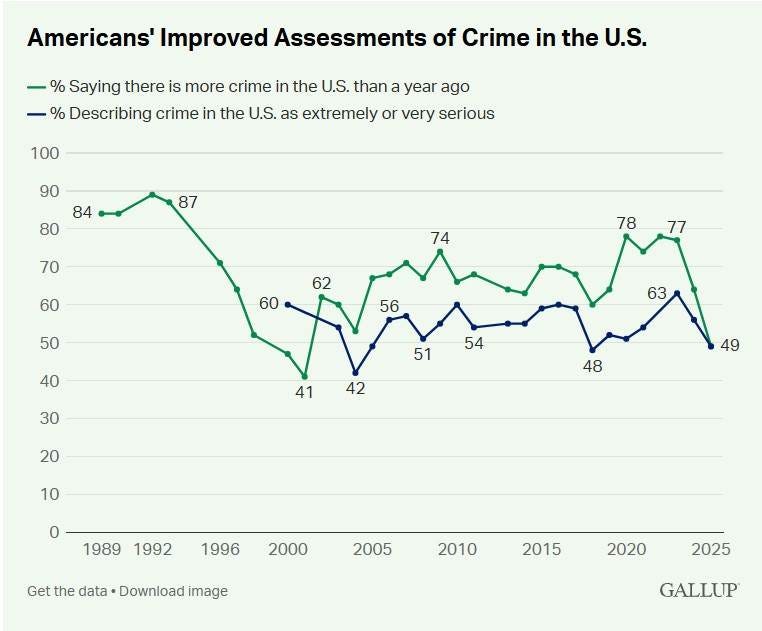
What’s interesting here is a new Gallup poll that shows, for the first time in almost three decades, the public’s perception of crime is matching the downward trend. The public does a good job of perceiving more crime, but a poor job of perceiving declines.
One argument that has gained a lot of traction is that this just reflects partisan politics. I think this argument is mainly true, but not wholly, and it is worth considering a second, complementary explanation for the convergence of fact and opinion. There has been considerable effort by many groups to put better information in front of the public, and the public has listened. This is a very encouraging sign and should not be met with indifference or cynicism.
The Gallup Poll
Americans today feel better about crime than they have in a long time. This Gallup graphic has generated enormous discussion over the last couple of weeks.
Let’s do a little data viz orienteering. You’ll note that the green line is the percentage of people who say that crime in the US is worse than the previous year, and the blue line is the percentage of people who say crime is a serious problem. There’s a lot going on in this graphic.
One interesting bit is that from about 1993 until 2000, crime plummeted, and the number of people saying crime was worse the previous year was declining. It’s easy to misinterpret this correlation. Fewer people were saying crime was getting worse, which is quite different from saying it was getting better. The poll doesn’t ask that question, so we don’t know. But we do know that even in the middle of the longest, steepest crime decline in American history, more than half of respondents thought crime was getting worse, for most of the decline.
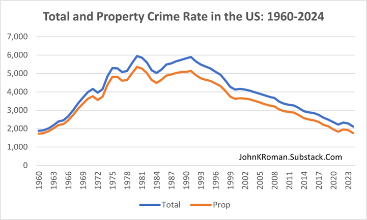
Even at the absolute best moment in this time period, 2001, 41 percent of Americans though crime was worse in 2001 than it was in 2000. Here’s a graph of crime trends over a longer period to provide some context.
Now, here’s the interesting bit. For 30 years, from 1991 to 2021, crime (measured as total crime) decreased every year. Except one. All crime was up a smidge between 2000 and 2001. If you look at the Gallup data, this is also the year that Americans were most optimistic! Very odd.
Maybe, a key part of the problem is that the people did not have access to national crime statistics during this time. Maybe data were old and stale by the time they became available to the public.
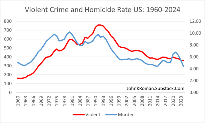
Again, when Americans say they are worried about crime, we don’t know exactly what they mean. Perhaps the problem is that Americans are thinking about serious violent crime when they answer the question, not minor property crimes. Here’s that graphic.
Here, the red line is violent crime, and the blue line is homicide. The violent crime data fit the Gallup responses better than the all crime and property crime data did. Where the crime/property crime historical trend is a steady decline from the early 1990s until today, the violent crime rate is steep in the 1990s and flat from 2000 onward. The homicide line correlates even more clearly to the Gallup data, with the 90s downtrend, the 2000-2020 steady rates, and the COVID spike and decline.
The takeaway is that there is some empirical evidence that when Americans say crime is getting worse, they mean homicide is getting worse! Hold that thought for a minute, we will come back to it.
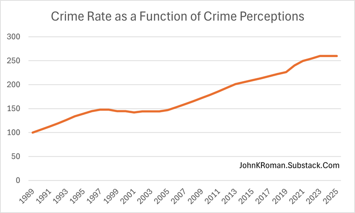
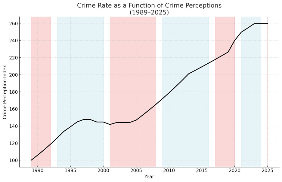
It is important to note that none of these data ‘fit’ the Gallup data well. One way to see this visually is to graph the Gallup data as a single continuous trend line. I will put the method in an endnote, but here’s the intuition.
Suppose we believe that Gallup respondents’ reports that crime is getting worse are perfectly correlated with crime trends. That is, let’s assume that Americans have perfect information about changes in crime and that their reports are precisely correct. If around half of Americans say crime is getting worse, it is reasonable to assume that the other half think crime is the same or getting better. So, for those years, let’s just assume the crime rate stayed the same. When the number of people saying crime is worse is larger, then we can assume a bigger change in crime, and so on. And we will make these assumptions both upwards and downwards.1 What would that data look like?
If Gallup reported perceptions of crime reflected real trends in crime reporting, then ‘crime’ in 2025 would be about 2.5X the 1989 crime rate. Since we’ve shown that, among macro crime indicators, homicide rates are most highly correlated with perceptions of crime, it’s fair to ask how many homicides we would expect to see in 2025 if the public had an accurate sense of risk. In 1989, the national homicide rate was 8.7 per 100,000; in 2025, the national homicide rate appears to be around 4.5 per 100,000. If the homicide rate were 2.5X the 1989 rate, there would be 21.7 homicides per 100,000, or nearly 74,000 homicides this year. In fact, the true number is likely to be around 15,000.
Does this mean the US is now five times more afraid than it was in 1989? I’m not sure. But we are clearly more afraid.
Back to the Gallup Data
There is evidence of a change in the way people think about crime. The percentage of Americans who believe crime increased in the US in the last year has hit its lowest level since 2001. One explanation is that it is all about partisan politics. Jill Castellano at The Marshall Project has a really thoughtful explainer on the recent Gallup data and how much of the change can be attributed to perceptions that are more correlated with who is in office than how much crime there is. It is a compelling narrative.
And one I think is correct, but with a coda: there is a great deal of accurate, unbiased crime data available in 2025 that was not available just three years ago, and certainly not before then. What I think has happened is that there is so much high-quality, timely, non-partisan data about what is really going on that it gives people cover to change their responses.
If you look at the last 25 years of Gallup data, highlighting which political party is in power, a second pattern emerges.
This is the crime perceptions chart I showed you earlier, now color-coded to represent who is in the White House. What’s interesting to note is that if only politics were at play, then any kinks in the line should appear at the beginning of an administration, when partisans change their mind, and bad is suddenly good, and good is suddenly bad. What you see instead is that the kinks tend to happen in the middle of the administration. That doesn’t mean that there is no partisan effect, just that the mechanism might be more subtle than it first appears.
One explanation is that, as the Wall Street folks like to say, at election time, crime perceptions are already priced into the market. People already have a firm belief about crime, and if there is no new information to change their minds, they won’t change. Only over a period of years does new information have an effect. But if that changed—if new information was available all the time—then a different pattern would emerge, one where partisans could use that new information to change their mind immediately. That appears to be happening for the first time this year.
The key idea is that there is historically a huge lag between the end of each year and the release of official national crime statistics. For decades, the FBI reported last year’s crime data almost a full year later, some time the following fall. By then, the news was dry and stale. Who, in the fall of 2019, really cared about crime in 2018? This was a persistent problem that affected the public’s perception of crime year after year.
But that situation got noticeably worse in 2023.
Due to a glitch in the national crime statistics, in the summer of 2023 the most recent official comprehensive national crime statistics were from … 2020. That’s because in the summer of 2023, the FBI had not yet released 2022 data. And the FBI’s 2021 data release was incomplete (and the 2021 data have not been corrected, so that hole remains). The FBI changed how local police report data in January 2021 and stubbornly refused to change the collection process, even after it became clear that thousands of local law enforcement agencies needed more time to comply with the new rules. Since more than one in three police agencies did not report, there was essentially no 2021 data to report in the fall of 2022.
So in July of 2023, the most recent national crime statistics described crime in 2020. This gap missed much of the national spike in violence, the peak of that violence wave, and a strong signal that the trend had reversed and violence was declining. People were still arguing over whether the George Floyd protests or COVID-19 changes in routine activities caused the violence spike, because there was no more recent data to provide clarity (spoiler: the spike was caused by COVID-19 disruptions). It should not be at all surprising that partisanship filled that gap.
But, as they say on Wall Street, gaps get filled, especially crucial ones. By 2024, Jeff Asher and AH Datalytics created the Real-Time Crime Index with monthly reporting of crime data from hundreds of cities, towns, and counties. The Council on Criminal Justice began releasing regular crime statistics from a sample of cities that made their data publicly available. The Major Cities Chiefs Association began releasing regular surveys of big-city police chiefs, describing what they were seeing locally in real time.
And my home institution, NORC at the University of Chicago, created the first daily crime statistics reporting site, with harmonized data from dozens of cities, released each day through the Live Crime Tracker. We also produce and host the Chicago Public Safety DataHub.
Today, the crime statistics industry is maturing, with many sources of recent crime data. Everytown now has EveryStat, a gun violence data site, as does The Trace, which has a DataHub. The Invisible Institute publishes the Civic Police Data Project and the National Police Index. The Gun Violence Archive remains an invaluable resource. Local data is available in many cities from research and non-profit partners. And police are beginning to make more of the public’s data available (though many still insist on publishing often-deceptive maps rather than releasing the actual data). Even the FBI is speeding up, now releasing preliminary monthly data.
The net effect is that the public has way, way more information. Call it the Asher Effect. And, lo and behold, perhaps as a result, public attitudes are coming more into line with the data.
And maybe, we now have a shared set of facts that will allow a better dialogue about how to sustain these huge crime declines. Here’s my idea from the Castellano article:
Gallup found that more than two-thirds of Americans now say more money and effort should go toward addressing underlying causes of crime, such as drug addiction, homelessness and mental health issues, rather than toward strengthening law enforcement.
“This would be a really good moment to embrace the public’s preference for social policy as a solution to crime rather than law enforcement as a solution to crime,” Roman said.
Notes and Quotes
My wife gifted me Nicholas Thompson’s The Running Ground for my birthday. I have read every running book there is—I’m like the Penn & Teller of running books—and this one is top tier. Maybe in anticipation of the holidays, I’ll do a ranking; everyone loves a list. But anyway, Thompson includes two dynamite quotes I feel an obligation to share. The first is advice from his father to him, which I have passed to my own children.
Never, never, never again take on mice when you can take on tigers. The mice have the right to chew you to death. The tigers will fight, and you will win.
The second is from Bobbi Gibb, who was the first woman to run the Boston marathon and summarizes all the running books and my own running gestalt.
You put one foot in front of the other, and you breathe this air. I can’t get over it. I can’t get over the fact that it all exists.
The Gritty calendar is out in time for the holidays. Let’s hear from the beast himself,
“The calendar market is oversaturated with sexy firefighters or cute furry animals. This calendar will cover all the bases … cute, furry, and sexy,”
Speaking of oversaturation in this season of peak mercantilism, I am reminded of my favorite quote about business mechanics. It’s said jokingly of the cable business, but it’s true of most modern commerce.
“There are two ways to make money in the cable business: Bundling. And unbundling.”
And to that point, remember, first principles as always. The first principle of marketing is that you only need marketing when your product is an undifferentiated commodity. Something to keep in mind this holiday season.
Cheers.
Note: It’s Autumn. There is a carpet of leaves outside my window, which will remain there unless a winter storm blows them elsewhere, as the Township has outlawed two-stroke gas leaf blowers. My electric leaf blower makes a happy fuss, but in the presence of anything more than a gentle breeze, the effect is more like stirring confetti in the air than blazing a trail. There is more yellow than red again this year, as the sycamores thrive in a warming climate and the maples and oaks continue their struggle. Early this week, there were two bucks across the street, chumming around in the sun and leaves, looking content. It’s all quite bucolic, but also a sign that the bill is due for all the off-hand promises I have made about things to be done by year’s end.
One thing I did do recently was to write several essays with the intention of publishing them on this very website. On reflection, some are best left where they are as digital detritus, but a small number can be salvaged, polished, and pushed over the finish line. If I were to follow best practice in marketing for social media fame, I would package them up with some histrionics and deliver them in regular order. But that seems a little much, so I will try to push some of them out over the next week since I have a little time. That will probably be followed by extended silence. Some will not doubt prefer the flurry, and others, the silence that follows. In my travels this last month, I actually met a couple of people out in the wild, in real life, who had nice things to say about this blog. So try and hang in there if you can and spread the word about External Processing—nothing brightens the holidays like a dash of crime policy. Cheers.
Musical Interlude
A commentary on the politics of the day? A note on having the children around for the holidays? A reminder that we’re all all right? Maybe, maybe, maybe.
Methodology for the johnkroman Crime Perceptions Index. From the Gallup table, pull the annual percentage of U.S. adults who say “there is more crime in the U.S. than a year ago.”
Set 1989 to an index value of 100.
If % in the 55-65% range → +2% change from prior year
If % in 65-75% → +4%
If % over 75% → +6%
If % in 45-55% → 0% change
If % in 35-45% → −2%
If % in 25-35% → −4%
If % under 25% → −6%


