

The 2020 Homicide Spike was not Primarily Caused by Protests
The Lead Explanation for the Great American Crime Decline Loses Some Steam, and a Race Report...

This graphic on Twitter is making the rounds as proof that the George Floyd protests caused the 2020 homicide spike. And I am surprised how many folks find it convincing. Or I guess I am not surprised since a lot of people from all over the political spectrum have blamed the protests for the 2020 homicide spike, see here, here, and here. And here. I suppose when you get Alex Tabbarok, Kevin Drum, and Noah Smith all singing out of the same hymnal, you’ve got a consensus. Still, I don’t buy it. Let’s see if I can convince you.
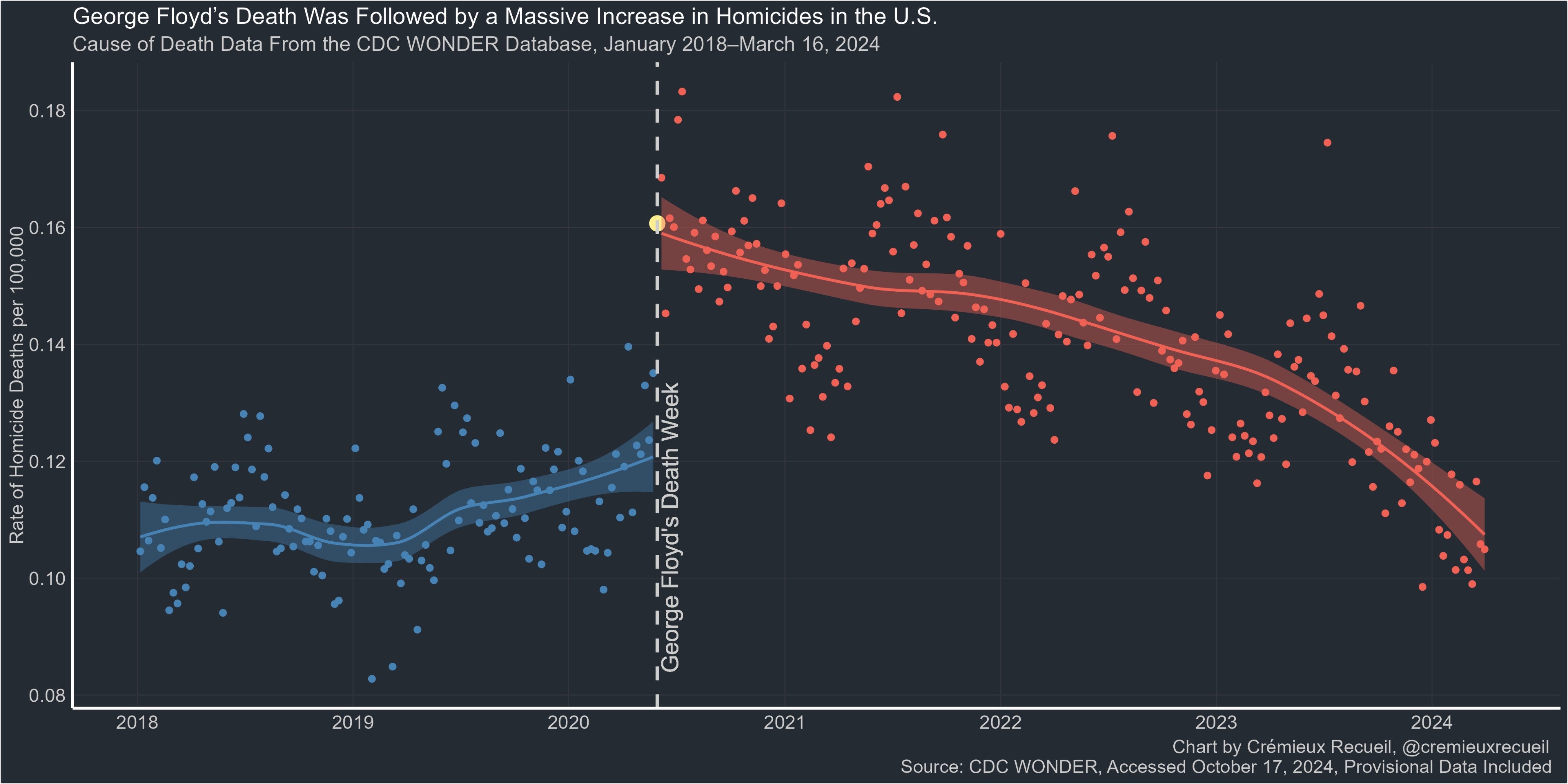
To its credit, the graphic does include the best data I’ve seen to test the ‘protests lead to the homicide spike’ hypothesis. It’s data from the Centers for Disease Control (CDC) provisional mortality statistics from the Morbidity and Mortality Weekly Report (by the way, you can do all of this analysis for yourself online here). This is high-quality data, so let me start by saying that the data are fine. It is the presentation that is misleading. Here’s the graphic:
Let’s go through the issues. Let me do the small ones first.
Blue = GOOD, Red = Bad. A little tug at your emotions with the color coding.
The Y-Axis is truncated to make the change look bigger than it was.
An extraneously long period of observation intended to make it look like they thoughtfully selected this period for analysis when in fact this is just the period the data cover for this series. That is, they just downloaded the whole dataset.
To give you a sense of how much effect those little problems have, here’s the exact same data on a more reasonable scale, without the colors, without the structural break May 25, 2020 imposed on the data and truncated to the period in question July 1, 2019—July 31, 2021.

Without all of the visual manipulation, it is not so obvious that there is a big break in trend at one singular moment in time pointing to a single cause as the only plausible explanation. The y-axis is a count of homicides across the United States, per week. The x-axis is the number of weeks since July 1, 2019. Again, I used the exact same data for this graphic that is in the Twitter graphic.
But I haven’t even gotten to the big problem with this analysis, and the problem I think most analyses of the 2020 homicide spike have had, which is that folks are imposing their answer on the data rather than letting the data lead to an answer. This is what I think of as policy-based evidence-making. It means that instead of letting the data speak, the authors assume an answer.
Here, the author has assumed that there was a structural break on May 25, 2020. And then conducted the analysis. The author says, “the result is so overwhelmingly clear you don’t need a statistical test to understand what happened.” I mean sure, once you have organized the analysis around a specific causal explanation, and not tested any other explanations, it’s pretty easy to find the answer to be compelling. It’s a little like empaneling a grand jury where the prosecutor presents all the evidence that fits their case, and the defense is nowhere to be found.
That’s the key. The author assumes an answer—the protests caused the data. But, there is no test of that assumption. Out of the infinity of possible explanations for the homicide spike in 2020, the author has selected one—PROTESTS—imposed it on the data and declared victory. Having arrived at an answer, instead of looking for one, the author tests whether the pre-protest trend and the post-protest trend are equivalent. And they are not. But that is hardly conclusive…
So, let’s do the same thing, but with a different causal explanation. Let’s do the same thing but instead of assuming the protests were the cause of the crime spike, let’s assume it was COVID.

In this graphic, instead of starting with the protests, I start with the pandemic as the cause of the trend in homicides.
I start my analysis on July 1, 2019. There is no need to go further back, the trend is firmly established, at least within the constraints of this dataset.
I mark the beginning of the COVID period using MMWR data on the week ending March 14, 2020. I use MMWR data on the week ending October 31, 2020 as the end of the period.
I end the period July 31, 2021 because that is one year after the end of large-scale protests.
Now, let’s put some trend lines in the graphic.

So, using identical data, I now have a graphic that tells a completely different story about the cause of the homicide spike in 2020. In this narrative, there was a slight downward trend in homicide in the period right before the pandemic starts. Then the pandemic hits and homicide shoots upward and right away. Then as the recovery starts post-COVID, homicide starts to decline but then returns to or exceeds the highest levels during the pandemic. That suggests three different mechanisms were at play—something pre-COVID, a COVID effect, and then a post-COVID effect.
What about the protests?

The weeks when the protests were most intense and widespread are highlighted in the red circle. I’ve also added a dotted line for the date of George Floyd’s murder and the beginning of the protests.
In this depiction of the homicide spike, the protests are an aberration from the general trend. The general trend was that as people stayed home, and local governments bled staff—police, teachers, courts, etc.—the homicide upward trend picked up steam. But the trend was well underway by the time the protests hit.
The Floyd protests (and the response to them) played a role in that they added carnage and loss for a short period when there were a lot of protests. But the main trend is about COVID, the protests and the response to them just made it worse for a while and then the trend returned to where it was already headed.
I think this story much better fits the history of events and what was actually happening in the US, rather than the stylized, ideological narrative that folks try and impose on it.
But here’s the thing and there is no getting around it. We need rigorous statistical analysis because the story is absolutely not “so overwhelmingly clear you don’t need a statistical test to understand what happened.”
We need statistical tests to identify the structural breaks in the data.
Controls for seasonality, since homicide is much higher in the summer every year.
Controls for state and city effects which are the unique contributions that specific attributes of places to homicide trends.
We need to test a variety of hypotheses, not just one and done.
And much, much more.
In conclusion, it’s hard for me to think of an event that is more of a Rorschach test for people’s ideology than their explanation for the cause of the 2020 homicide spike. People don’t like disorder in general, and protests specifically. And that makes people want to hang on to one explanation. I get it. But that should not be where you start the analysis…
Did Lead Cause the Crime Decline?
No hypothesis about why crime declined in the 1990s has received as much attention as the lead hypothesis. Whenever I write something about why crime declined in the 1990s, I get a flurry of people responding, ‘we already know the answer—it’s about lead.’ So, on one hand, great! I’m glad people are engaged and that good scientific studies are permeating. On the other hand, it’s not just about lead.
Real quick, here’s the story. In the 1970s two important environmental things happened. One was that we started remediating lead paint. And the second was that we took the lead out of gasoline1. The idea is that exposure to lead can cause real damage to your brain and that one of the ways that damage manifests is through a loss of impulse control. Impulsivity and criminality are linked, so scientific and intuitive support exists for the theory.
It turns out that leaded gas was the worst culprit, that breathing in leaded fumes increases exposure by multiples compared with exposure to lead paint. So it was the ubiquity of unleaded gas before reform, and then the scarcity of leaded gas after reform, that is hypothesized to have reduced crime a generation later.
When young men arrived at their most crime-prone ages in the 1990s, they had not been exposed to leaded gas fumes as children in the late 1970s and 1980s, and thus had not experienced damage to their brain, and thus were less crime-prone. And thus crime declined rapidly, in almost every corner of the United States. Jessica Reyes Wolpaw authored a serious study of the association of lead and crime, it caught the fancy of public intellectuals, and a theory became mainstream.
Here’s the thing though. It’s a good theory, it certainly explains part of the crime decline, but we can see now that there was much more to it.
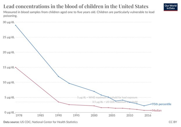
Essentially what this graphic shows is huge reduction in toxic lead exposure from the late 1970s until about 1990. This generally correlates to the Great American Crime decline which was a huge decline in violence from about 1991-2000. If children were exposed to less lead in the 1970s and 1980s, it makes sense that crime declined in the 1990s.
But lead exposure continued to decline after 1990. Both the median exposure and the exposure for the most lead exposed (the 95th percentile) fell about 80% between 1990 and 2016.
But crime has not been on a downward trajectory since 2000. Crime was essentially flat and moved in a relatively narrow range from 2000-2020. If the big declines in lead exposure in the 1970s and 1980s led to big crime declines in the 1990s, you would expect that the smaller but still substantial declines in lead exposure in the 1990s would have led to smaller but still substantial declines in crime in the 2000s. But this didn’t happen. And the further you move toward today, the less weight the lead theory appears to hold.
Certainly, the relationship between lead and crime becomes more complex in a larger historical context.
I would argue that focusing on lead misses the point, at least a little bit. Reducing exposure to lead was part of a larger movement to reduce exposure to all kinds of toxic chemicals—DDTs were a noxious pesticide banned about the same time that leaded gas began to be phased out, in the early 1970s. The 1976 Toxic Substances Control Act (and let’s take a moment to consider what a world was like where you needed Congress to step in and ban toxic substances because there was such a substantial and powerful constituency arguing, no, no, DDTs are great! yowza) banned CFCs and other toxins.
All of this was part of a broader agenda to reduce exposure to toxins that all arguably began with the passage of the National Environmental Policy Act (NEPA) in 1970 and signed by noted crazed environmentalist Richard M. Nixon.
Let me make two points.
Point number one is that none of the environmental reform was about reducing crime! Changes in the rules about lead exposure and the other efforts to reduce exposure to toxins were about the government stopping industry from poisoning people; banning CFCs were about reducing the continent-sized holes in the ozone layer, etc. Now, I don’t know if banning CFCs or DDTs or any of the non-lead NEPA regulations eventually reduced crime.
But the larger point is that a person’s propensity to commit crimes is due in no small part to individual exposure to toxins and trauma. Some toxins and trauma have smaller effects on crime, some larger. The point is that the propensity to commit a crime is the result of accumulated risks—the total sum of exposure. Less exposure is good. And again, here’s the thing, none of these changes were undertaken with the specific goal of reducing crime. Hold that thought.
Point number two is that there is no silver bullet in reducing crime. There is no one thing. Not police or prisons or lead. If you want to reduce crime, a really good place to start is by exposing fewer people to fewer toxins and trauma.
Because if you don’t reduce exposure to toxins and trauma, then you have to fix the results. And one thing criminologists tend to agree on is that it is easier to fix places than people, because fixing people is really hard.
Sure, that’s true. But that argument is all about fixing things that are already broken, not preventing things from breaking. It’s about intervening when things have already gone sideways as if interventions were the only tool in the toolbox.
Right there, next to the hammer and the plumbing wrench of intervention, is prevention.
A Race Report
Endure is an interesting book. It’s been out for three or four years now, but it’s one of those books with some nuggets that stay with you. It’s a book about human endurance and the great exploits people accomplish that defy our sedentary imaginings. People who free dive and hold their breaths for impossibly long periods. People who run or bike or walk hundreds or thousands of miles.
These ideas were on my mind last Sunday morning as I watched twin CH-46 Sea Knights fly rotor to rotor above the Pentagon and waited for the howitzer to signal the start of the annual Marine Corps marathon. I plan to run a marathon every year and some years I do. There is no real rhythm to a year that includes a marathon and one that does not. Sometimes it works out and sometimes it does not. Sometimes the big hurdle is getting to the start line. Sometimes it is getting to the finish line.
Anyway, the key idea in Endure (Mind, Body and the Curiously Elastic Limits of Human Performance) is that humans, and this is hardly a novel thought, can sustain movement much longer than our prey. In ye olde times, humans would start up in pursuit of whatever beast we were after and methodically chase them until they keeled over. Humans: we chase stuff down. The ability to sweat and to have an Achilles tendon seem to have been our key advantages. Later on, our opposable thumb and intellect would dominate, but our success really begins with the very under-rated sweat gland which nature did not provide to our food.
So, we are hard-wired to plod along sweatily for long periods of time. But for how long? It’s a good question. According to Endure, in order to protect us from ourselves, our brains have evolved early warning systems, for those times when our sweatiness and springy Achilles tendons are insufficient, and we begin to tire in ways that are dangerous to the health of ourselves and to our selfish brains.
You are probably aware of these warnings. Flushing, trouble catching your breath, burning legs, these are all the mild symptoms of looming exhaustion. More major symptoms include hallucinations, total loss of balance, and perhaps some incontinence thrown in for the funsies. This is your brain’s way of saying, look, things are going to get really bad, really soon if we don’t sit over there and have a mocha.
Now, the great lesson of Endure, the book, which is full of scientific insights from extremely believable people who own a lab coat with their name stitched on it, the great lesson of this book is that your brain is really conservative. Well, ‘really’ conservative is perhaps a relative concept, but your brain does start telling you it is time to stop quite a while before it is actually, definitively, time to stop.
And what Endure teaches you is to just ignore your brain. What Endure says is, when you can no longer catch your breath, and your legs have given out, and your balance is off-time, and you are hallucinating, and the incontinence is profound, you can keep going.
Just keep going.
And when your brain is screaming at you, screaming ‘Oh my God, we have to stop right now OR WE ARE GOING TO DIE’ you can just ignore it and continue free diving or summiting without oxygen or finishing that marathon you sort of trained for.
I am happy to report that none of those things happened last weekend. But the book still helped me, just a little, because I got some signals really early on that were quite disconcerting. One in particular. By the second mile—that’s mile 2 out of 26—my right hamstring really hurt. Quite a lot in fact. And my human performance was quickly becoming inelastic.
And the rubber band attaching me to the pace group I aspired to, stretched and stretched and broke by mile 3, and that group of happy runners disappeared up the road. By mile 7, the next pace group had caught and passed me and that rubber band was stretching and stretching, and the negative thoughts were pounding away, and the end was maybe in sight, right there, at a point so early in the race that the medical teams had not yet assembled. But then a little question tugged at me, and when it broke through the roaring tinnitus of negativity, it asked me if I actually felt any worse than I had at mile 2?
And the thing was, I didn’t. Feel any worse that is. There’s an old saying in running that things don’t always get worse, and they hadn’t. And by mile 10 I was still hanging on with the 2nd pace group and beginning to think, hey, I feel ok, I’m actually having a pretty good day. And by mile 16 I was running next to the official pacer person, who was holding the sign with my secondary goal time on it, and by mile 18 I was well ahead. Anyway, there was another hour of running to do after that and it definitely got worse and continued to get worse but then the race ended and I was about one minute ahead of that 2nd pace group and it was a damn fine day! And I am glad that this year included a marathon.
So that’s my race report. If you are interested in good writing about running and life then you should read Haruki Murakami in the New Yorker on running and life or buy his short and lovely book. And maybe give Endure just a skim.
As I wrote this sentence, the catchphrase from 1980s classic rock radio advertisement rang in my mind, “it’s time to get the Led out.” Led Zeppelin that is. In my high school, loosely, there were Deadheads, Led-heads, and Talking Heads. I keep waiting for a Talking Heads resurgence, but maybe it was just of the moment and is no more…
Another great post. Looking at the COVID vs. George Floyd protest issue all I keep thinking is "por que no los dos?" Why does it have to be one or the other when the two (especially one on top of the other) would seem both to explain the outcome in part. Oh, well. Just screaming into the void. Also very interested to learn about the evolutionary significance of the sweat gland. Going to add that to my explanatory arsenal. Cheers and thanks.